harmony is very important.When we are walking in the street ,i dare to say that all of you have paid attention at other poeople's look whatever they are our friends or strangers.Harmony in the clothing is when the arrangement of colors and outfit are pleasing to the people eyes.If our outlook is too chaotic ,you may scare the people included your friends away.
ANALOGOUS COLOR SCHEME
 This color scheme uses colors that are next to one another on the color wheel. With an analogous color scheme, one color is usually the dominant one, while the others serve as an accent to the dominant color. We are limited in colors when using this scheme but that does not mean our looks have to be boring. Just vary the intensity (how dull or bright a color is) and value (how light or dark a color is) to make our styles more interesting and pleasing to the eye.
An example of three colors next to each other on the color wheel, that can be used in an analogous color scheme are BLUE, VIOLETand VIOLET-BLUE. Use only a few different colors with the analogous color scheme.
*
*
COMPLEMENTARY COLOR SCHEME 
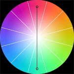
This is a good choice if we want strong contrast in our looks. Colors are opposite each other on the color wheel. You could also vary the intensity and values as well. It can be difficult to create balance with this color scheme.
Examples of complementary color schemes are reds with greens, oranges with blues and violets with yellows. It is different to match the outfit,so that we should have a little change in that.For instance, instead of using plain orange, you could use colors on either side like red-orange and yellow orange. Instead of using plain blue, you could use combinations like blue-violet or blue green.


This is a good choice if we want strong contrast in our looks. Colors are opposite each other on the color wheel. You could also vary the intensity and values as well. It can be difficult to create balance with this color scheme.
Examples of complementary color schemes are reds with greens, oranges with blues and violets with yellows. It is different to match the outfit,so that we should have a little change in that.For instance, instead of using plain orange, you could use colors on either side like red-orange and yellow orange. Instead of using plain blue, you could use combinations like blue-violet or blue green.

*
*
TRIADIC COLOR SCHEME
 This uses three colors that are evenly spaced or equidistant from one another on the color wheel. This scheme produces strong contrast but still retains harmony. We can get carried away by making all three colors too intense thereby destroying the balance in our looks. We should allow one color to dominate and use the two other colors to accent the rest of the outfit.
BLUE +RED + YELLOW & GREEN +ORANGE +VIOLET
 This uses three colors that are evenly spaced or equidistant from one another on the color wheel. This scheme produces strong contrast but still retains harmony. We can get carried away by making all three colors too intense thereby destroying the balance in our looks. We should allow one color to dominate and use the two other colors to accent the rest of the outfit.
BLUE +RED + YELLOW & GREEN +ORANGE +VIOLET
*
*
SPLIT COMPLEMENTARY COLOR SCHEME
 It uses three colors and is a twist on the complimentary color scheme. Instead of using the colors compliment, We will use the two colors adjacent to its compliment on the color wheel.
For instance, Red, Yellow-Green and Blue-Green could be a split complimentary color scheme.yellow, red-purple and blur-purple .orange, green-blue and purple-blue.green,purple-red and orange-red . violet,green-yellow and orange-yellow.blue,yellow-orange and red orange
*


SPLIT COMPLEMENTARY COLOR SCHEME
 It uses three colors and is a twist on the complimentary color scheme. Instead of using the colors compliment, We will use the two colors adjacent to its compliment on the color wheel.
For instance, Red, Yellow-Green and Blue-Green could be a split complimentary color scheme.yellow, red-purple and blur-purple .orange, green-blue and purple-blue.green,purple-red and orange-red . violet,green-yellow and orange-yellow.blue,yellow-orange and red orange
*
*
MONOCHROMATIC COLOR SCHEME
It uses variations in value and intensity of only one color. We only need to create a value plan using one color, which makes things a lot easier.Our style will not be as exciting as other schemes that utilize more than one color, but our style will produce a peaceful and soothing effect.
It uses variations in value and intensity of only one color. We only need to create a value plan using one color, which makes things a lot easier.Our style will not be as exciting as other schemes that utilize more than one color, but our style will produce a peaceful and soothing effect.


.jpg)


 發表文章
發表文章