He came to London from Germany in 1986. He initially photographed celebrities, and then quickly graduated to shoots for youth style magazines such as The Face and i-D. He is regarded as one of the most influential of contemporary fashion photographers. He has shot all of the advertisements for Marc Jacob's clothing line.
----------------------------
Marc Jacobs Spring/Summer 2008 ad campaignwith Victoria Beckham by Juergen Teller(v).


Inspiration -Teletubbies
Marc Jacobs spring summer 2006 advertising campaign
with Meg White by Juergen Teller(v)


Marc Jacobs Fall winter 2005 advertising campaign
with Kirsten MacMenamy by Juergen Teller(v)


by Juergen Teller(v)


with Samantha Morton by Juergen Teller(v)


Preserve
The longing of mankind for unspoilt naturalness is greater than ever. The wide-open space of Nordic landscapes sets the mood with a range of cool, authentic natural shades. Vegetal and mineral shades modulate olive green, khaki and fango tones to icy blue nuances. Sulphur and woolly Ecru stimulate the restrained prevailing mood. Casual attitude is the ideal ground for a relaxed, but quality appearance. Today‘s claim to comfort characterizes stamps the materiality.


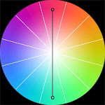
we felt comfortable.Most of the ads used warm and cool colour and
the Saturation of these colour is Low .they dont belong to same hue,
we will think that these colurs are familiar and both giving the soft feeling.
 Warm colors are vivid in nature. They are bold and energetic. Warm colors are those that tend to advance in space; therefore, caution needs to be taken so you do not overwhelm your content with eye catching hues. If an element in your design needs to pop out, consider using warm colors to do that.
 Cool colors are soothing in nature. They give an impression of calm and rarely overpower the main content or message of a design. Cool colors tend to recede; therefore, if some element of your design needs to be in the background, give it cool tones.


沒有留言:
張貼留言